Geoff McFetridge on Public Art at Hollywood Park
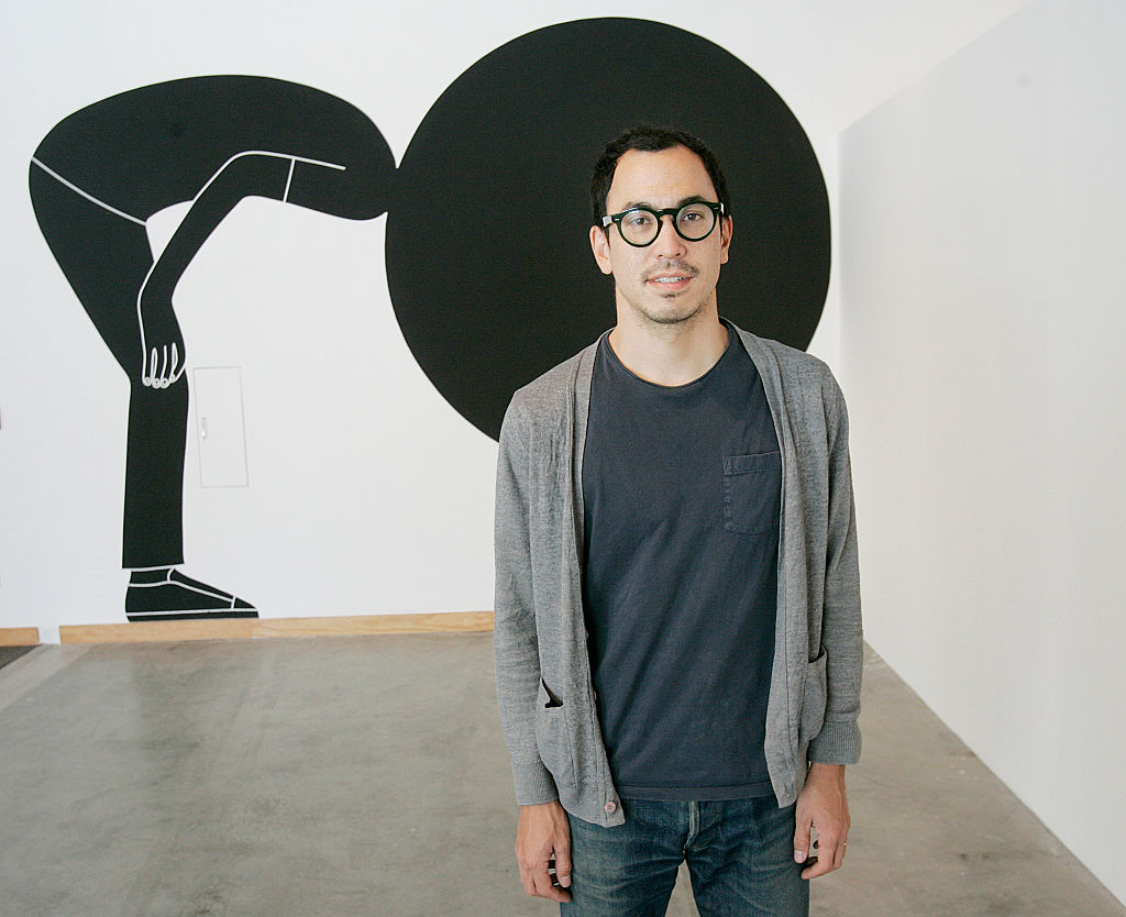
Geoff McFetridge doesn’t wait for inspiration. As an artist and graphic designer who works on a variety of commercial projects, “I don’t have that luxury,” he explains. Growing up in Calgary, Alberta, he studied commercial art as an undergraduate at the Alberta College of Art and then moved to Los Angeles for CalArts’ graduate program in graphic design. Since then, he’s developed an artistic practice that straddles the line between commercial and fine art, using his knowledge of graphic design to create work that’s deeply personal. He has created work for big-name brands and publications like the Atlantic, Warby Parker, Nike, and Intel – and designed the title cards for Spike Jonze’s 2009 film adaptation of Where the Wild Things Are.
McFetridge was first drawn to artistry through skateboarding and street culture, and those same inspirations also drew him to the Los Angeles art scene.
“There are so many aspects of Los Angeles as a creative space,” he says. “And the sprawl of LA is sort of like a big canvas.”
The flip side to that canvas is the city’s constant development and the issues that come with its seemingly inevitable change. For McFetridge, who’s spent years working on various artistic projects in and around Inglewood, it isn’t just a place you drive past on your way to LAX—it captures a spirit of Los Angeles that’s precious to any Angeleno. “It’s a neighborhood that has yet to change in a city that’s in constant flux,” he says. And, as the Hollywood Park project brings some of that fluctuation to Inglewood’s doorstep, McFetridge hopes to evoke the emotional complexities of Los Angeles’ development in his artwork.
“What is it like to be an Angeleno—to be living in a city and dealing with change?” he says of his inspiration. “What is it like to be someone who lives in a city where, ten years from now, you’ll go back to your favorite corner store and it will be completely different? You’re always preparing for that kind of heartbreak.”
Expressing that sentiment through visuals was part of McFetridge’s artistic process for the Hollywood Park project. He wanted to create an image that addressed complex, ethereal subject matter by articulating emotions that are difficult to express through words—“those small notions and feelings that you don’t know how to talk about,” as he describes them. By combining his graphic design training with his fine art practice, he drew and developed those ideas as if he’d been hired to create a logo for a company. “I use that process to express sentiments that we all share – logos for feelings,” he says of his Hollywood Park project.
“…I think you can only hope that it enriches the existing neighborhood, creates spaces that are usable, and encourages a culture that was here already.”
FOLLOW THE PROGRESS

